Protein Structure Networks with Bio3D
Background:
Bio3D1 is an R package that provides interactive tools for structural bioinformatics. The primary focus of Bio3D is the analysis of bimolecular structure, sequence and simulation data.
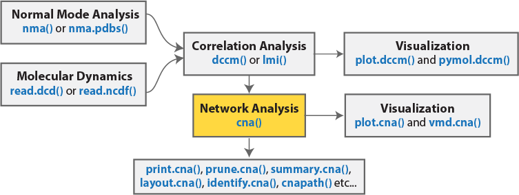
The Bio3D package (version 2.1 and above) contains functionality for the creation and analysis of protein structure networks. This vignette will introduce this functionality by building and analyzing networks obtained from atomic correlation data derived from normal mode analysis (NMA) and molecular dynamics (MD) simulation (Figure 1)2. Note that Bio3D contains extensive functionality for both NMA and MD analysis. An introduction to each of these areas is detailed in separate NMA and MD vignettes.
Requirements:
Detailed instructions for obtaining and installing the Bio3D package on various platforms can be found in the Installing Bio3D Vignette available both on-line and from within the Bio3D package. Note that this vignette also makes use of the IGRAPH R package, which can be installed with the command
install.packages("igraph")
Part I: Basic network generation and visualization
In this section we will first focus on correlation network analysis derived from NMA, and in subsequent sections MD.
Network generation from normal mode analysis data
The code snippet below first loads the Bio3D package, then reads an example PDB structure from the RCSB online database. We then follow the flow in Figure 1 by performing NMA, then dynamic cross-correlation analysis, and finally network analysis with the cna() function.
library(bio3d)
library(igraph)
pdbfile <- system.file("examples/hivp.pdb", package = "bio3d")
pdb <- read.pdb( pdbfile )
modes <- nma(pdb)
cij <- dccm(modes)
net <- cna(cij, cutoff.cij=0.3)
To enable quick examination of the network analysis results we provide cna specific variants of the print(), summary() and plot() functions, as demonstrated below:
print(net)
##
## Call:
##   cna.dccm(cij = cij, cutoff.cij = 0.3)
##
## Structure:
##  - NETWORK NODES#:   198     EDGES#: 752
##  - COMMUNITY NODES#: 8   EDGES#: 11
##
##  + attr: network, communities, community.network,
##         community.cij, cij, call
# Summary information as a table
x <- summary(net)
##  id size                      members
##   1   36      c(1:8, 89:107, 190:198)
##   2   20        c(9:11, 22:32, 83:88)
##   3   24              c(12:21, 60:73)
##   4   28       c(33:46, 55:59, 74:82)
##   5   16            c(47:54, 146:153)
##   6   17     c(108, 122:130, 183:189)
##   7   28          c(109:121, 159:173)
##   8   29 c(131:145, 154:158, 174:182)
# Other useful things are returned from **summary.cna()**
attributes(x)
## $names
## [1] "id"      "size"    "members" "tbl"
# List the residues belonging to the 5th community
x$members[5]
## $`5`
##  47  48  49  50  51  52  53  54 146 147 148 149 150 151 152 153
##  47  48  49  50  51  52  53  54 146 147 148 149 150 151 152 153
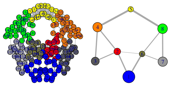
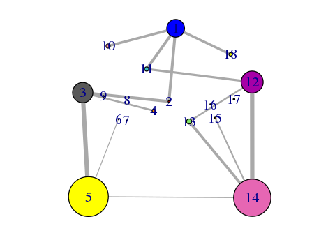
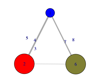
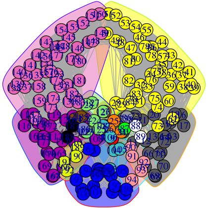
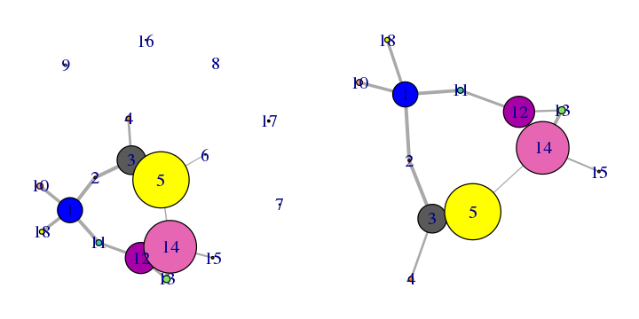
# Plot both the ‘full’ all-residue network and simplified community network
plot(net, pdb, full = TRUE, vertex.label.cex=0.7)
plot(net, pdb)
Side note:
The raw correlation matrix obtained from NMA (or indeed MD) typically has many small but non-zero value elements. By default the cna() function excludes some of the weakest values (close to zero) to avoid building an edge heavy network, which would considerably slow down further analysis. The cutoff.cij argument in the cna() function specifies the lower boundary for considering correlation values. All values whose absolute value is lower than cutoff.cij will be ignored when defining network edges.
Note that the above code plots both a full all-residue network as well as a more coarse grained community network - see Figure 2. In this example, and by default, the Girvan-Newman clustering method was used to map the full network into communities of highly intra-connected but loosely inter-connected nodes these were in turn used to derive the simplified network displayed in Figure 2B. We will discuss community detection in a separate section below and for now simply highlight that a comparison of the full network and the distribution and connectivity of communities between similar biomolecular systems (e.g. in the presence and absence of a binding partner or mutation) has the potential to highlight differences in coupled motions that may be indicative of potential allosteric pathways. This approach has previously been applied to investigate allostery in tRNA–protein complexes, kinesin motor domains, G-proteins, thrombin, and other systems [1-5].
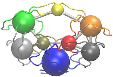
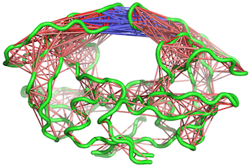
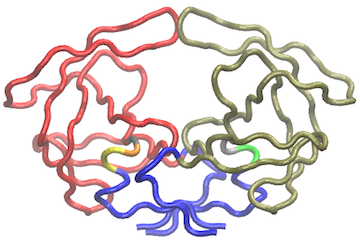
Another useful function for the inspection of community structure is the vmd.cna() function, which permits interactive network visualization in the VMD molecular graphics program (see Figure 3).
# View the network in VMD (see Figure 3)
vmd.cna(net, pdb, launch = TRUE)
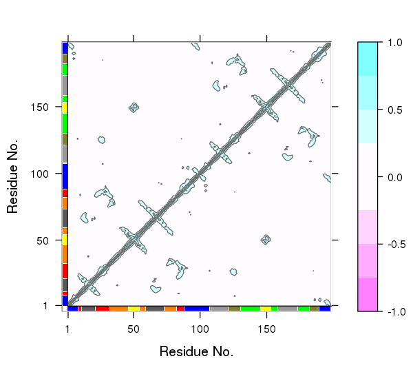
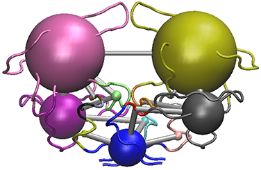
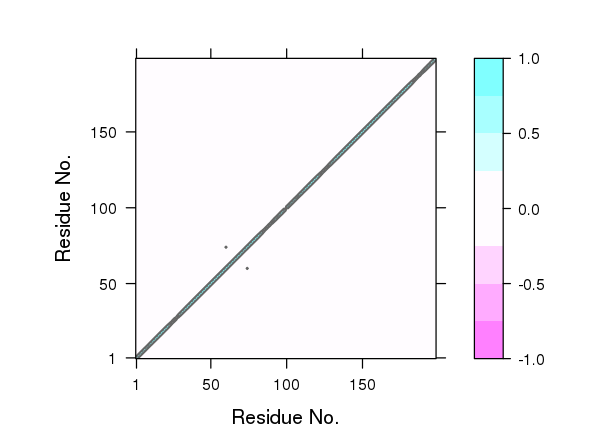
One of the main advantages of correlation network analysis is that it often facilitates the interpretation of correlated motions that can be challenging to rationalize from the output of a dynamic correlation map alone (e.g. the output of the dccm() function). For example, the identified communities of highly intra-connected residues can be tied into the visualization of the correlation data (Figure 4) and cross referenced to the network visualizations presented in Figures 2 and 3. In this example the colored marginal segments of Figure 4 match the identified communities in Figures 2 and 3:
# Plot the correlation matrix with community annotation, see Figure 4.
plot.dccm(cij, margin.segments = net$communities$membership, main="")
The structure of cna() network objects
To more fully appreciate the results of network analysis one should become somewhat familiar with the structure of the object returned from the cna() function. This will allow you to generate customized visualizations beyond those in Figures 2 to 4 and also enable you to more fully examine the effect of different parameters on network structure and topology.
The output of the cna() function is a list object of class cna with both network and community structure attributes. These are summarized at the bottom of the print(net) results above (see the line begining with '+ attr') and can be explicitly listed with the attributes(cna) command:
attributes(net)
## $names
## [1] "network"           "communities"       "community.network"
## [4] "community.cij"     "cij"               "call"
##
## $class
## [1] "cna"
Here we introduce each of these components in turn:
$network: The full protein structure network typically with a node per residue and connecting edges weighted by their corresponding correlation values (i.e. input cij values optionally filtered by the user defined 'cutoff.cij'). This filtered cij matrix is also returned in the output as$cij, as listed below.$communities: A community clustering object detailing the results of clustering the full$network. This is itself a list object with a number of attributes (seeattributes(net$communities)for details). Notable attributes include$communities$membership,$communities$modularityand$communities$algorithm. These components detail the nodes (typically residues) belonging to each community; the modularity (which represents the difference in probability of intra- and intercommunity connections for a given network division); and the clustering algorithm used respectively.$cij: The filtered correlation matrix used to build the full \$network.$community.network: A coarse-grained community network object with the number of nodes equal to the number of communities present in$communities(i.e. the community clustering of the full network discussed below) and edges based on the inter-community coupling as determined by the input 'collapse.method' (by default this is the maximum coupling between the original nodes of the respective communities).$community.cij: A cij matrix obtained by applying a "collapse.method" on$cij. The rows and columns match the number of communities in \$communities. The individual values are based on the cij couplings of inter-community residues. The currently available collapse methods for defining these values include: max, mean, trimmed and median.
Both the $network and $community.network attributes are
igraph compatible network objects [6]
and contain additional node (or vertex) and edge annotations that can be
accessed with the V() and E() functions in the following way:
# Basic data access follows the igraph package scheme
head(V(net$network)$color)
## [1] "#0000FF" "#0000FF" "#0000FF" "#0000FF" "#0000FF" "#0000FF"
V(net$community.network)$size
## [1] 36 20 24 28 16 17 28 29
E(net$community.network)$weight
##  [1] 0.4959895 0.4579519 0.5620385 0.5190477 0.7274177 0.4988692 0.3649480
##  [8] 0.3648937 0.6414050 0.5867744 0.4989730
V(net$community.network)$name
## [1] "1" "2" "3" "4" "5" "6" "7" "8"
In addition to various Bio3D functions, the full set of extensive igraph package features can thus be used to further analyze these network objects.
The community clustering procedure
The $communities attribute returned by the cna() function
provides details of the community clustering procedure. This procedure
aims to split the full network into highly correlated local
substructures (referred to as communities) within which the network
connections are dense but between which they are sparser. A number of
community detection algorithms can be used to solve this so called
graph-partitioning problem. The default Girvan-Newman edge-betweenness
approach is a divisive algorithm that is based on the use of the edge
betweenness as a partitioning criterion. "Betweenness" is calculated by
finding the shortest path(s) between a pair of vertexes and scoring each
of the edges on this/these path(s) with the inverse value of the number
of shortest paths. (So if there was only one path of the shortest
length, each edge on it would score 1 and if there were 10 paths of that
length, each edge would score 1/10.) This is done for every pair of
vertexes. In this way each edge accumulates a "betweenness" score for
the whole network. The network is separated into clusters by removing
the edge with the highest "betweenness", then recalculating betweenness
and repeating. The method is fully described in (Girvan and Newman, 2002
PNAS) [7].
A useful quantity used to measure the quality of a given community
partition is the modularity (detailed in the
$communities$modularity component of cna() output). The
modularity represents the difference in probability of intra- and
inter-community connections for a given network division. Modularity
values fall in the range from 0 to 1, with higher values indicating
higher quality of the community structure. The optimum community
structures obtained for typical MD and NMA derived correlation networks
fall in the 0.4 to 0.7 range.
head(net$communities$modularity)
## [1] -5.770111e-03 -4.430715e-03 -3.616681e-03 -8.542082e-04  2.043481e-05
## [6]  2.076868e-03
max(net$communities$modularity)
## [1] 0.7381234
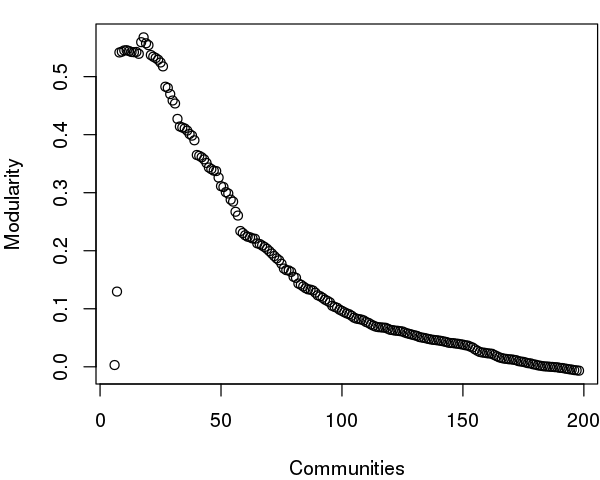
The community.tree() function can be used to reconstruct the community membership vector for each clustering step. Here we plot modularity vs number of communities.
# See Figure 5.
tree <- community.tree(net, rescale=TRUE)
plot( tree$num.of.comms, tree$modularity, xlab="Communities", ylab="Modularity")
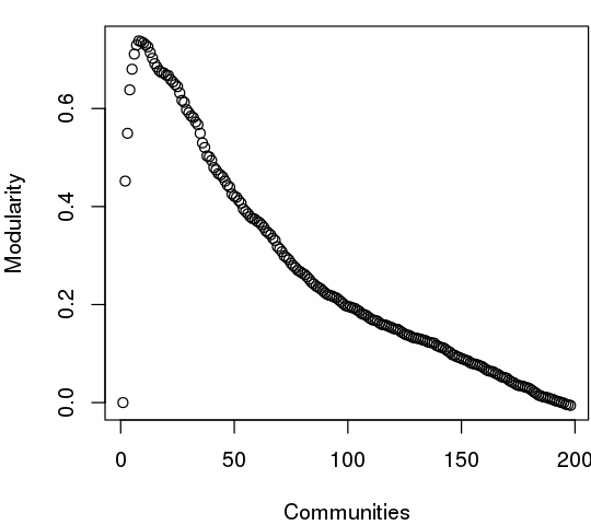
Note that there are many points near the maximum modularity value in Figure 5. In such cases a number of alternative community partitions may be equally high scoring and therefore worth inspecting more closely. For example we will often favor a partition point with a smaller number of overall communities but slightly lower modularity score based on some prior knowledge of the system (for example results from a related system).
Below we inspect the maximum modularity value partitioning and the number of communities (k) at the point of maximum modularity. Based on a quick inspection of the clustering dendrogram we explore a new membership partitioning (at k=3). Again this example is purely for demonstrating some of the available functionality within the package and we encourage motivated readers to explore the true structure within their data by examining multiple structures together with the effects of different input parameters and clustering procedures.
max.mod.ind <- which.max(tree$modularity)
tree$num.of.comms[ max.mod.ind ]
## [1] 8
# Membership vector at this partition point
tree$tree[max.mod.ind,]
##   [1] 1 1 1 1 1 1 1 1 2 2 2 3 3 3 3 3 3 3 3 3 3 2 2 2 2 2 2 2 2 2 2 2 4 4 4
##  [36] 4 4 4 4 4 4 4 4 4 4 4 5 5 5 5 5 5 5 5 4 4 4 4 4 3 3 3 3 3 3 3 3 3 3 3
##  [71] 3 3 3 4 4 4 4 4 4 4 4 4 2 2 2 2 2 2 1 1 1 1 1 1 1 1 1 1 1 1 1 1 1 1 1
## [106] 1 1 6 7 7 7 7 7 7 7 7 7 7 7 7 7 6 6 6 6 6 6 6 6 6 8 8 8 8 8 8 8 8 8 8
## [141] 8 8 8 8 8 5 5 5 5 5 5 5 5 8 8 8 8 8 7 7 7 7 7 7 7 7 7 7 7 7 7 7 7 8 8
## [176] 8 8 8 8 8 8 8 6 6 6 6 6 6 6 1 1 1 1 1 1 1 1 1
# Should be the same as that contained in the original CNA network object
all( net$communities$membership == tree$tree[max.mod.ind,] )
## [1] TRUE
# Inspect the clustering dendrogram (Figure 6). To match colors use 'colors=vmd_colors()[memb.k3]'
h <- as.hclust(net$communities)
hclustplot(h, k=3)
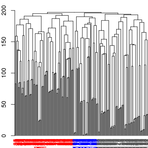
# Inspect a new membership partitioning (at k=3)
memb.k3 <- tree$tree[ tree$num.of.comms == 3, ]
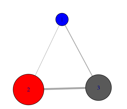
# Produce a new k=3 community network (Figure 7)
net.3 <- network.amendment(net, memb.k3)
plot(net.3, pdb)
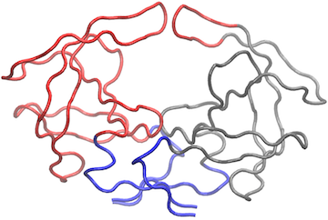
# View the network in VMD (see Figure 8)
vmd.cna(net.3, trim.pdb(pdb, atom.select(pdb,"calpha")), launch=TRUE )
Network generation from molecular dynamics data
For this example section we apply correlation network analysis to a short molecular dynamics trajectory of Human Immunodeficiency Virus aspartic protease (HIVpr). This trajectory is included with the Bio3D package and stored in CHARMM/NAMD DCD format. To reduce file size and speed up example execution, non C-alpha atoms have been previously removed (see the Trajectory Analysis vignette for full details).
The code snippet below first sets the file paths for the example HIVpr starting structure (pdbfile) and trajectory data (dcdfile), then reads these files (producing the objects dcd and pdb).
dcdfile <- system.file("examples/hivp.dcd", package = "bio3d")
pdbfile <- system.file("examples/hivp.pdb", package = "bio3d")
# Read MD data
dcd <- read.dcd(dcdfile)
pdb <- read.pdb(pdbfile)
inds <- atom.select(pdb, resno = c(24:27, 85:90), elety = "CA")
trj <- fit.xyz(fixed = pdb$xyz, mobile = dcd,
               fixed.inds = inds$xyz, mobile.inds = inds$xyz)
Once we have the superposed trajectory frames we can asses the extent to which the atomic fluctuations of individual residues (in this very short example simulation) are correlated with one another and build a network from this data:
# See Figure 9.
cij <- dccm(trj)
net <- cna(cij)
plot(net, pdb)
Side note:
*Due to the often noisy nature of correlations calculated from short MD simulations, we typically suggest running longer simulations and multiple replica simulations from which a consensus correlation matrix and consensus network can be generated and compared to results obtained from individual simulations. For example, see the following works: Scarabelli and Grant, (2014). Kinesin-5 allosteric inhibitors uncouple the dynamics of nucleotide, microtubule and neck-linker binding sites, Biophys J. 107:2204 and Yao, et al., and Grant, (2016). Dynamic coupling and allosteric networks in the alpha subunit of heterotrimeric G proteins. J. Biol. Chem. 291:4742. *
Note that the dccm() function can be slow to run on very large trajectories. In such cases you may want to use multiple CPU cores for the calculation by setting the 'ncore' option to an appropriate value for your computer - see help(dccm) for details.
# View the correlations in pymol (see Figure 10).
pymol.dccm(cij, pdb, type = "launch")
# View the structure mapped network (see Figure 11).
vmd.cna(net, pdb, launch = TRUE)
As noted above, maximization of modularity sometimes creates unexpected community partitions splitting visually obvious domains into many small community 'islands'. In such cases we look into partitions with modularity close to the maximal value but with an overall smaller number of communities (see above).
# See Figure 12.
tree <- community.tree(net, rescale=TRUE)
plot( tree$num.of.comms, tree$modularity, xlab="Communities", ylab="Modularity" )
# Example function using community.tree() and network.amendment()
mod.select <- function(x, thres=0.1) {
   remodel <- community.tree(x, rescale = TRUE)
   n.max = length(unique(x$communities$membership))
   ind.max = which(remodel$num.of.comms == n.max)
   v = remodel$modularity[length(remodel$modularity):ind.max]
   v = rev(diff(v))
   fa = which(v>=thres)[1] - 1
   ncomm = ifelse(is.na(fa), min(remodel$num.of.comms), n.max - fa)

   ind <- which(remodel$num.of.comms == ncomm)
   network.amendment(x, remodel$tree[ind, ])
}
nnet = mod.select(net)
nnet
# See Figure 13.
plot(nnet, pdb)
# See Figure 14.
vmd.cna(nnet, pdb, launch=TRUE)
Using a contact map filter:
In the original Luthey-Schulten and co-workers approach to correlation network analysis [1] edges were only included between “in contact” nodes. Contacting nodes were defined as those having any heavy atom within 4.5 Å for greater than 75% of the simulation. The weight of these contact edges was then taken from the cross-correlation data. This approach effectively ignores long range correlations between residues that are not in physical contact for the majority of the trajectory. To replicate this approach one can simply define a contact map with the cmap() function and provide this to the cna() function along with the required cross-correlation matrix, e.g.:
cm <- cmap(trj, dcut = 4.5, scut = 0, pcut = 0.75, mask.lower = FALSE)
net.cut <- cna(cij, cm = cm)
One could also simply multiple the correlation matrix by the contact map to zero out these long-range correlations. However, we currently prefer not to use this filtering step as we have found that this approach can remove potentially interesting correlations that might prove to be important for the types of long-range coupling we are most interested in exploring. For example, compare the plot of correlation values below in Figure 15 to those in Figure 4.
# See Figure 15.
plot.dccm((cij * cm), main="")
## Plot non-filtered DCCM
##plot.dccm(cij, margin.segments = net$communities$membership)
It is also possible to use a consensus of contact map and dynamical correlation matrices from replica simulations with the functions filter.cmap() and filter.dccm() - see their respective help pages for further details.
Part II: Customized network visualization
We have already introduced the plot.cna() and vmd.cna() functions in earlier sections. Here we focus on methods for customizing network layouts, colors, labels, nodes and edges for visualization.
The layout.cna() function can be used to determine the geometric center of protein residues and communities and thus provide 3D and 2D network and community graph layouts that most closely match the protein systems 3D coords.
layout3D <- layout.cna(net, pdb, k=3)
layout2D <- layout.cna(net, pdb, k=2)
Other network layout options are available via the igraph package, see ?igraph::layout in R for details.In addition, one can provide any 2D plotting coordinate values to plot.cna() to generate alternate orientations.
Identifying nodes/communities and their composite residues
The identify.cna() function allows one to click on the nodes of a plot.cna() network plot to identify the residues within a give set of nodes. This can also be a useful first step to determine the placement of text labels for a plot -see help(identify.cna) for details.
# Click with the right mouse to label, left button to exit.
xy <- plot.cna(net)
identify.cna(xy, cna = net)
Color settings and node/edge labels
The vmd_colors() function is used by default to define node color. This can be changed to any input color vector as demonstrated below. Note that the vmd_colors() function outputs a vector of colors that is ordered as they are in the VMD molecular graphics program and changing the colors will likely break this correspondence.
grp.col <- bwr.colors(20)[net$communities$membership]
Useful options in plot.cna() to be aware of include the optional flags 'mark.groups' and 'mark.col', which let one draw and color areas around groups of residues corresponding to the community clustering or any other residue partitioning of interest (see Figure 16):
grp.col <- list()
for (i in 1:max(net$communities$membership)) {
  grp.tmp <- which(net$communities$membership == i)
  grp.col[[i]] <- grp.tmp
}
colbar.full <- vmd_colors()[net$communities$membership]
colbar.comms <- vmd_colors(max(net$communities$membership), alpha = 0.5)
# See Figure 16.
plot(net, pdb, full = TRUE, mark.groups = grp.col, mark.col = colbar.comms)
Network manipulation
The prune.cna() function allows one to remove communities under a certain size or with less less than a certain number of edges to other communities prior to visualization or further analysis. For example, to remove communities composed of only 1 residue (see Figure 17):
net.pruned <- prune.cna(net, size.min = 2)
##  id size                 members
##   1   21 c(1:7, 95:102, 193:198)
##   2    2                     8:9
##   3   24         c(10:23, 63:72)
##   4    4                   24:27
##   5   47         c(28:62, 73:84)
##   6    1                      85
##   7    1                      86
##   8    1                      87
##   9    2                   88:89
##  10    5                   90:94
##  11    5                 103:107
##  12   26     c(108:122, 162:172)
##  13    6                 123:128
##  14   44     c(129:161, 173:183)
##  15    2                 184:185
##  16    1                     186
##  17    2                 187:188
##  18    4                 189:192
## Removing Nodes: 7, 8, 9, 16, 17, 6
## id   size    edges   members
## 6    1   1   85
## 7    1   0   86
## 8    1   0   87
## 9    2   0   88:89
## 16   1   0   186
## 17   2   0   187:188
# See Figure 17.
plot.cna(net)
plot.cna(net.pruned)
Applying this command to our network example, you can see how the communities composed by less than 2 residues are deleted from the graph.
Calculating network node centrality and suboptimal paths through the network. {#calculating-network-node-centrality-and-suboptimal-paths-through-the-network.}
Node centrality describes the distribution of the edges in the network. In protein-networks, identifying the nodes with many edges (hubs) as well as the segments with a high number of connections can yield insights into the internal dynamic coordination of protein regions. Centrality measures can also be employed to characterize protein sections showing differences in coupled motions between networks derived from different states (e.g. ligand bound and unbound etc.).
There are a number of different measures of node centrality, from the simplest one that counts the number of edges of each node (node degree) to the more complex (such as betweenness centrality). For example, the betweenness centrality of a node is defined as the number of unique-shortest paths crossing that node. This measure has the advantage of considering the whole network topology and not only the closest neighbors in its calculation (as is the case with node degree).
The igraph package provides different functions to perform these calculations (such as degree, betweenness and closeness). Below we report an example output of the betweenness centrality on our simple HIVP network:
node.betweenness <- betweenness(net$network)
# See Figure 18.
plot(node.betweenness, xlab="Residue No", ylab="Centrality", type="h")
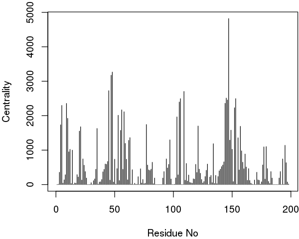
Interestingly, in extended trajectories of this system the regions with the highest centrality values are the two flaps of the HIVpr structure, whose dynamics and interactions are likely important of substrate processing. To examine this for your own system you could map these values (or any other metric of interest) to the B-factor column of a PDB file for viewing in VMD or other molecular graphics software that can color by this column:
# Output a PDB file with normalized betweenness mapped to B-factor
write.pdb(pdb, b=normalize.vector(node.betweenness), file="tmp.pdb")
Suboptimal paths calculation. {#suboptimal-paths-calculation.}
Identifying residues potentially involved in the dynamic coupling of distal protein regions can be facilitated by calculating possible linking paths through the correlation network objects. To run such an analysis, we can use the Bio3D function cnapath() and associated tools for printing and visulization (summary.cnapath(), print.cnapath() and vmd.cnapath()).
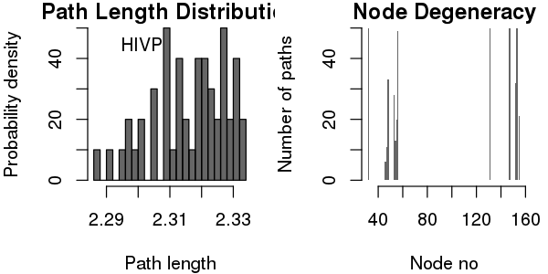
pa <- cnapath(net, from=32, to=131, k=50)
The 'from' and 'to' arguments in above function call represent the node IDs of the two ends (denoted by 'source' and 'sink', respectively) in the path anlaysis. The number of paths calculated is specified by the argument 'k' (Here we explore 50 suboptimal paths).
Some basic statistics about the paths, including path length distribution and node degeneracy (number of paths going through each node) can be obtained by using the function print() (or summary() for a similar effect).
print(pa)
## Number of paths in network(s):
##      50
##
## Path length distribution:
##
## [2.287,2.297] (2.297,2.306] (2.306,2.315] (2.315,2.324] (2.324,2.333]
##             4             6            13            12            15
##
## Node degeneracy table:
##
##  32   46   47   48   53   54   55   56   131  147  152  153  155
##  1.00 0.12 0.22 0.66 0.56 0.26 0.40 0.98 1.00 1.00 0.64 1.00 0.42
# Or, simply type 'pa'

# Compare two or more sets of paths
# (e.g. from networks of the same system but under distinct states)
# print(pa1, pa2, ...)

# Also generate plots for path length distribution and node degeneracy; See Figure 19.
print(pa, label="HIVP", plot=TRUE)
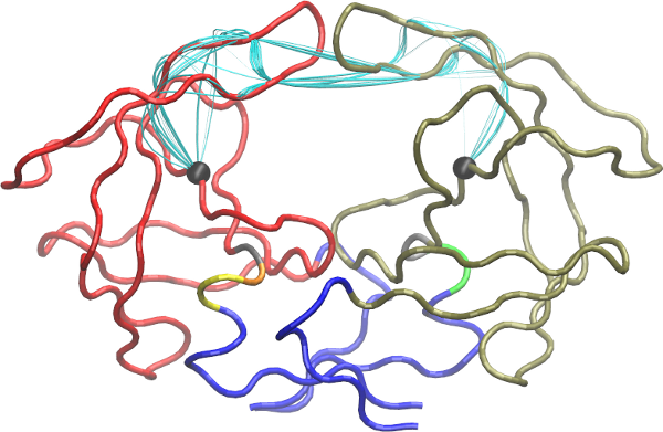
To visulize paths use the function vmd.cnapath() (NOTE: you need VMD installed properly).
# See Fig 20
vmd.cnapath(pa, pdb=pdb, spline=TRUE, col='cyan', launch=TRUE)
Side-note:
Set spline=FALSE to get faster loading of paths in VMD. Also, set launch=FALSE if you want to view paths later. To do that, load the two files generated by the function, 'vmd.cnapath.pdb' and 'vmd.cnapath.vmd', in VMD (Read VMD manual for more detailed instruction).
To view an example of the output obtained and how key residues involved in the allosteric signaling were identified, please read the following work: Scarabelli and Grant, (2014). Kinesin-5 allosteric inhibitors uncouple the dynamics of nucleotide, microtubule and neck-linker binding sites, Biophys J, 107, 2204-2213 and Yao, et al., and Grant, (2016). Dynamic coupling and allosteric networks in the alpha subunit of heterotrimeric G proteins. J Biol Chem, 291, 4742-4753.
Alternatively, suboptimal path analysis can be performed with the WISP program [8]. It is easy to interface the protein network built using Bio3D with WISP to perform a search for the shortest paths between two selected network nodes. WISP requires an input adjacency matrix of the network, which can be saved in a file using the following command:
write.table(net$cij, quote=FALSE, row.names=FALSE, col.names=FALSE, file="adj.txt")
Summary
In this vignette we have confined ourselves to introducing relatively simple correlation network generation protocols. However, the individual Bio3D functions for network analysis permit extensive customization of the network generation procedure. For example, one can chose different node representations (including all heavy atoms, residue center of mass, Calpha atoms for each residue, or collections of user defined atoms), different correlation methods (including Pearson and mutual information), different community detection methods (including Girvan-Newman betweenness, Random walk, and Greedy modularity optimization approaches), as well as customized network layouts and result visualizations. We encourage users to explore these options and provide feedback as appropriate.
Although the protocols detailed herein can provide compelling results in a number of cases, defining an optimal procedure for network generation is an area of active research. For example rearrangement of some residues in the communities and changes in the total number of communities may be observed among different community structures based on different independent MD simulations of the same system. These variations of community structures are partially due to the small changes in the calculated cij values that reflect statistical fluctuations among independent simulations. However, changes in mutual information or correlation values may still be relatively small and differences among independent community structures may be largely due to limitations of the modularity metric, a methodology that was originally developed for binary adjacency matrices, where edges are counted without taking into account their lengths. We are currently developing a modularity methodology that is more closely aligned to protein dynamics data. We are also developing integrated 3D viewing functions (so VMD and PyMol will no longer be absolutely required during the exploratory interactive phase of analysis), as well as functionality to facilitate analysis of the interactions that generate changes in the community network.
References
[1] Sethi A, Eargle J, Black AA, Luthey-Schulten Z. Proc Natl Acad Sci U S A.2009, 106(16):6620-5.
[2] Scarabelli G and Grant BJ, PLoS Comput Biol 9, e1003329.
[3] Yao X, Grant BJ, Biophys J 105, L08–L10.
[4] Yao X, Malik RU, Griggs NW, Skjaerven L, Traynor JR, Sivaramakrishnan S, and Grant BJ, J Biol Chem 291, 4742-4753.
[5] Gasper PM, Fuglestad B, Komives EA, Markwick PR, McCammon JA. Proc Natl Acad Sci U S A. 2012 Dec 26;109(52):21216-22.
[6] Gábor Csárdi, Tamás Nepusz. InterJournal Complex Systems, 1695, 2006.
[7] Girvan M, Newman ME. Proc Natl Acad Sci U S A. 2002 Jun 11;99(12):7821-6.
[8] Van Wart AT, Durrant J, Votapka L, Amaro RE. J. Chem. Theory Comput., 2014, 10 (2), pp 511–517.
Document Details
This document is shipped with the Bio3D package in both R and PDF formats. All code can be extracted and automatically executed to generate Figures and/or the PDF with the following commands:
library(rmarkdown)
render("cna_vignette.R")
Information About the Current Bio3D Session
print(sessionInfo(), FALSE)
## R version 3.4.1 (2017-06-30)
## Platform: x86_64-redhat-linux-gnu (64-bit)
## Running under: CentOS Linux 7 (Core)
##
## Matrix products: default
## BLAS/LAPACK: /usr/lib64/R/lib/libRblas.so
##
## attached base packages:
## [1] stats     graphics  grDevices utils     datasets  methods   base
##
## other attached packages:
## [1] igraph_1.1.1  bio3d_2.3-3   rmarkdown_1.5
##
## loaded via a namespace (and not attached):
##  [1] Rcpp_0.12.13    lattice_0.20-35 digest_0.6.12   rprojroot_1.2
##  [5] grid_3.4.1      backports_1.0.5 magrittr_1.5    evaluate_0.10
##  [9] highr_0.6       stringi_1.1.5   tools_3.4.1     stringr_1.2.0
## [13] yaml_2.1.14     parallel_3.4.1  compiler_3.4.1  pkgconfig_2.0.1
## [17] htmltools_0.3.6 knitr_1.15.1
-
The latest version of the package, full documentation and further vignettes (including detailed installation instructions) can be obtained from the main Bio3D website: http://thegrantlab.org/bio3d/ ↩
-
This document contains executable code that generates all figures contained within this document. See help(vignette) within R for full details. ↩